Rebuilding a 2013-Era Clinic Website with Claude Code
I’ve been the de facto webmaster for a small acupuncture clinic in Palm Coast, Florida since about 2013. “Webmaster” is generous. I uploaded a static page once, and then didn’t touch it for over a decade.
The site technically worked. It had the phone number, the doctors’ bios, a list of conditions, some patient reviews, and a map. But it looked like 2013: a fixed 960px layout, jQuery, a “waypoints” scroll library, an html5shiv shim for Internet Explorer, and a folder of font files for a typeface the page barely used. Worse, jQuery, Font Awesome, and Google Fonts were all loaded over plain http://. Serve that over HTTPS (which GitHub Pages does by default) and the browser blocks every one of them as mixed content. The page quietly falls apart.

I didn’t want to rewrite it by hand. After the last experiment went well, I pointed Claude Code at the folder and said, roughly: make this modern, keep all the information, and make sure it runs on GitHub Pages.
It read before it wrote
The first thing it did was not write code. It listed every file, opened the old index.html, actually looked at the images (the banner, the headshots, the bamboo background), and inventoried the content: both physicians and their bios, the acupuncture and herbal medicine explanations, the full conditions list, every patient testimonial, the address, hours, email, and the Leaflet map.
Only then did it plan: a static, mobile-first single page; HTTPS fonts and inline SVG icons instead of the http:// CDNs; vanilla JavaScript instead of jQuery; delete the IE7 cruft. This is why the rebuild kept every review and the exact phone number instead of producing a generic “wellness clinic” template.
The output was three files. Semantic HTML with JSON-LD structured data so search engines know it’s a local medical business with hours. A stylesheet built on CSS variables with a responsive grid and a sticky header. And about 60 lines of JavaScript for the mobile nav, scroll reveals, and the map. It kept Leaflet with OpenStreetMap tiles specifically because that needs no API key, which is the right call for a site that should just work with zero configuration or billing.
The part that earned my trust
After building the site, it started a local server, drove a real browser, checked the console, confirmed every image returned a 200, and then tested the mobile layout at 375px. And it found a bug. The hamburger menu, which should have been tucked off-screen until tapped, was rendering on top of the page. The translateY(-130%) in the CSS just wasn’t applying.
Instead of guessing, it debugged. It read the computed styles and saw the transform was the identity matrix. It confirmed the rule existed and the media query matched. It tested whether transforms worked on other elements (yes) versus the menu (no). The cause: the menu was position: fixed inside a header that had backdrop-filter for a frosted-glass effect, and an ancestor with backdrop-filter becomes the containing block for fixed descendants. Real, well-known browser gotcha. Exactly the kind of thing that ships broken because nobody opens the mobile menu.
The fix was to move the menu into normal document flow and collapse it with max-height and opacity instead of a transform. Then it re-verified both states. At one point its measurements contradicted each other, and it figured out the background preview tab was throttling CSS transitions, so it was reading values mid-animation. It disabled the transitions and measured again. I’ve watched people take longer to reason through that.
Honest about the blurry photo
One of the doctor headshots was blurry, and I asked if AI could clean it up. It checked and told me the source was only 282×212 pixels, which is why it looked bad at display size. It ran a classical upscale/denoise/sharpen pass and showed me the before and after, but was upfront that this can’t invent detail that was never captured, and pointed me at a real AI upscaler or a higher-resolution original if I wanted better. I’d rather have that than a confident overpromise.
Design direction from real references
I gave it three sites I liked and asked what borrowing from them would look like. It opened each one and pulled out the shared language: warm earthy palettes, serif headlines with italic emphasis, arched image frames, and clean light layouts broken up by one dark “statement” band.
The first pass overreached. It added a script font and some decorative words (“harmony,” “Kind words,” “Begin your healing”) that looked goofy. I said so. It didn’t just delete them. It worked out why they felt off: on the reference sites, the script text is always the brand name, never random decoration. It also took a content note seriously. I pointed out the clinic is an acupuncture and traditional Chinese medicine practice, not an “East meets West” fusion thing, and it re-themed that section. Then it fixed my biggest complaint, one long monotonous beige scroll, with a single dark charcoal section in the middle of the page. That came straight from the references, not from guessing.

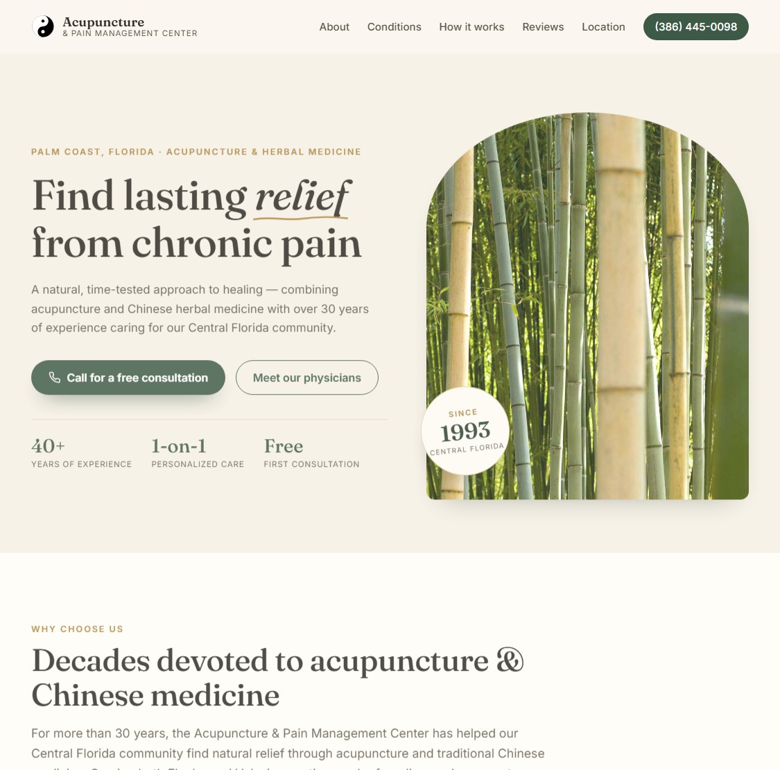
The bamboo is still there because it’s the clinic’s identity. It just sits in an arched frame next to a real headline, a tappable phone number, a free-consultation button, and a trust bar.
When I was happy, it committed and pushed. It noticed my local tooling config in the folder and added it to .gitignore instead of committing it. Small thing. Separates a tool that helps from one that makes a mess.
What changed underneath
| Before | After | |
|---|---|---|
| Layout | Fixed 960px, jQuery + waypoints | Responsive CSS Grid/Flex, vanilla JS |
| Dependencies | http:// jQuery, Font Awesome, fonts |
HTTPS fonts + inline SVG icons |
| Legacy cruft | IE7 CSS, html5shiv, webfont kit | Removed |
| SEO | Basic meta tags | JSON-LD MedicalBusiness + semantic HTML |
| Map | Leaflet/OSM | Leaflet/OSM, restyled, still no API key |
| Mobile | One narrow breakpoint | Mobile-first, tested at 375px |
| Hosting | Breaks on HTTPS | Deploys cleanly on GitHub Pages |
Caveats
The AI did its job in an afternoon back in June. The clinic’s actual domain kept serving the 2013 version for months afterward, because pointing it at the new site was on me and I didn’t get around to it. Very on brand. That’s finally fixed, so the “after” screenshot is what you get at acupuncturepainmgmt.com now.
Also, this went well partly because the starting point was tiny: one page, no backend, no build step. I wouldn’t extrapolate this to a real application.
Takeaways
- Bring the content, not just the vibe. It kept everything because it read the existing site first. If you have a starting point, point it at that.
- Give it real references. “Make it modern” is vague. Three sites I liked gave it a concrete vocabulary, and when its first take missed, the same references were how we corrected it.
- Let it verify. The most valuable part wasn’t the code generation. It was the browser testing and the debugging. A tool that runs your site and checks it is worth more than one that emits files.
- Push back. “This looks goofy” and “we’re an acupuncture practice” got far better results than vague approval.
The bit that still feels new isn’t that AI writes code. It’s that it read before it wrote, tested what it built, found and proved a real bug, told me the truth about what it couldn’t do, and took feedback like a collaborator. The clinic repo is on GitHub if you want to see the result.
Like the last post, this one was drafted with Claude Code from the notes of the actual session.